
Neither artificial intelligence nor digital effects: this is how Apple Music created its new and controversial icon
The company from Cupertino explains how it created its new visual identity using glass, oil, and musical vibrations. It chose hands-on work instead of relying on artificial intelligence.
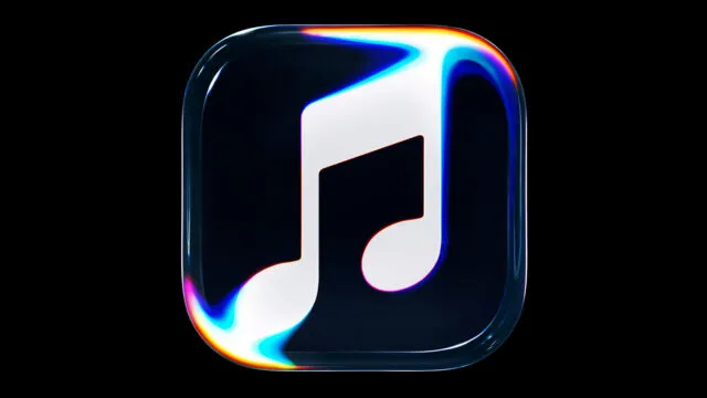
Apple has found a way to explain one of its most talked-about design changes in recent days. The company has released a video showing how it created the new Apple Music visual identity. The black-and-white icon has drawn criticism from some users. Instead of using standard digital animation, Apple carried out a physical experiment. Sound made a liquid move, and those movements helped shape the new symbol.
The project, called "Made by Sound", is more than a simple design change. Apple wants to explain how its new identity was created and show the value of artistic experimentation at a time when artificial intelligence is changing how people create things. The result has a similar look to the transparent surfaces and reflections found in Liquid Glass, the visual style Apple has added to its operating systems.
Take a look behind the scenes of Made by Sound. This is a story about music, teamwork, and skilled work with @fredagainagain1 and NEST Acoustics. See how sound brought the Apple Music logo to life, with everything recorded directly by a camera. Just music, made visible. pic.twitter.com/ZyMRGdUVUX
— Apple Music (@AppleMusic) October 21, 2026
How Apple created the new Apple Music logo
The video shows a setup built around a glass container filled with mineral oil. A clear object shaped like the app's icon sits above the oil. When a piece of music made for the project starts playing, the vibrations make the liquid move and form patterns. A camera records these patterns directly.
This method makes sound waves part of the creative process. Instead of creating reflections, distortions, and transparent effects on a computer, the team uses real materials to get the look it wants. British music producer Fred again.. helped by creating the music, while NEST Acoustics took part in developing the sound setup.
The video shows how physical materials are used to build an image, from setting everything up to capturing the final result. It gives the public a look at work that usually stays hidden when a brand creates its visual identity: the tests, the materials, and the creative choices behind a symbol that may look simple.
The rebranding that did not convince everyone
The new icon has caused debate. Its black-and-white design is different from the colorful image long associated with Apple Music, and some people have criticized it on social media. The change has been linked to beta versions of iOS 27.2, but users' reactions do not necessarily mean Apple will change the design before its final release.
The video now explains the idea behind the change. Apple presents the logo as a visual way to show sound, rather than simply a graphic that helps people recognize the app on an iPhone screen. The new identity also includes a custom typeface and updated branding across Apple Music's digital channels.
There is also a clear difference between the icon and the video. The video explores reflections and colors, while the app icon uses a much simpler design. For now, Apple has not confirmed whether the final design will include different colors.
Apple supports hands-on creativity as AI grows
This campaign follows a creative approach Apple has used in other videos. The company has previously shown how it makes advertisements using real-world effects and actual recordings, rather than relying only on computer-generated images.
Here, materials such as glass and oil also create a visual link to Liquid Glass, the style of see-through surfaces and reflections used in Apple's latest interfaces. But this time, the effect is not just created on a screen. It comes from a real setup that reacts to the vibrations of music.
The message comes as artificial intelligence tools make it faster to create images, videos, and music. Apple is showing another approach: using technology while still valuing hands-on work, experiments, and the direct involvement of creative professionals. People may or may not like the new icon, but Apple has chosen to defend its design by showing how it was made.